This tutorial will show you how to take a PSD template and turn it into a HTML/CSS template.
This is part two of creating a simple and professional blog layout. This part will focus on slicing and coding the PSD template created in the first part.
- Part 1: Simple and Professional Blog Layout using Photoshop
- Part 2: Simple and Professional Blog Layout PSD/HTML Conversion.
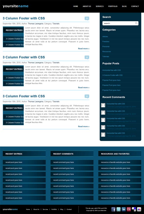
Final Result
Here is what we are looking to create. Click on the screenshot below to see a working demonstration of the HTML template.
Getting Started
Make sure to grab the PSD template from part one as you will need it to extract the images we will be using for tutorial.
For this tutorial, I am assuming you have a basic understanding of HTML and CSS. However, if you experience any problems, just leave a comment below and I’ll do my best to answer your questions.
Designing Your Directory Structure
Create an empty folder on your computer called “website”. Inside of that folder, create two folders called “images” and “js”. Then create two files and name them index.html, style.css. Lastly we will be using jquery to animate an effect so make sure to download that and place it in the js folder.
Add the Basic HTML Structure
We begin by opening index.html with your choice of a code editor. I’ll be using Dreamweaver for this tutorial, as that is what I prefer. Most code editing applications will do this automatically for you when you create a new page. Here is what the code block should look like for the required HTML 5 tags.
|
1 2 3 4 5 6 7 8 9 |
<!DOCTYPE html> <html lang="en"> <head> <meta charset="utf-8" /> <title>Simple and Professional Blog Layout</title> </head> <body> </body> </html> |
Link CSS and JS Files
Inside the <head> tags, you need to add the following code to reference our stylesheet.
|
1 |
<link rel="stylesheet" href="style.css" media="screen" /> |
The code to reference the external jquery script will be placed right before the </body> tag.
|
1 |
<script src="js/jquery-1.4.3.min.js"></script> |
The Layout Elements
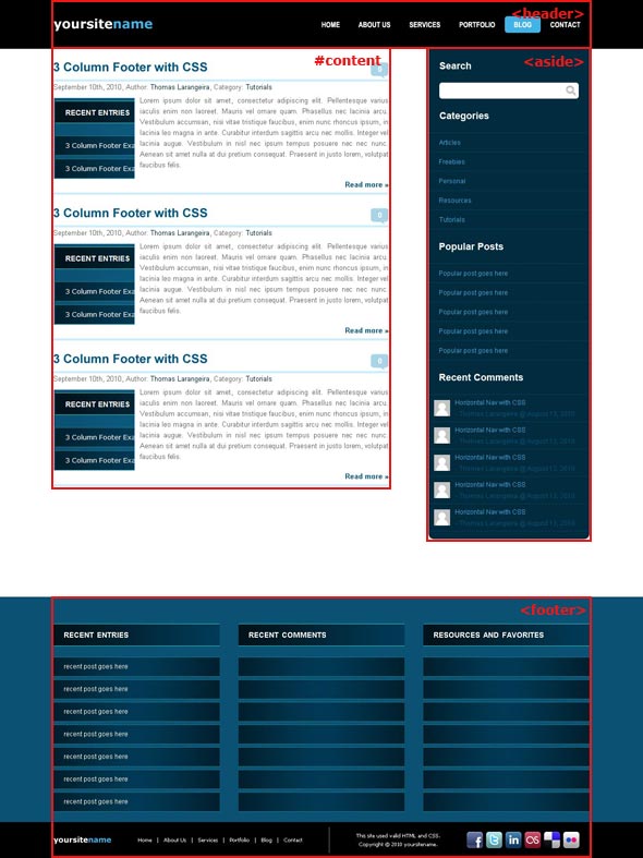
Below, you can see the different layout elements of the HTML/CSS template. These will be the main sections of our website layout. This is how our website will be setup, with the exception of the footer element being divided into two separate sections.
Code the Basic Layout Structure
We will start by coding the basic layout structure of our index.html. Add the following code inside the <body> tags to create the main sections of our website.
|
1 2 3 4 5 6 7 8 9 10 11 12 13 14 15 16 |
<div id="container"> <header> <div class="centering"> </div> </header><!-- End Header !--> <div id="main" class="centering"> <section id="content"> </section><!-- End Content !--> <aside> </aside><!-- End Aside !--> </div> </div><!-- End Container !--> <footer> <div class="centering"> </div> </footer><!-- End Footer !--> |
<div id=”container”> is used in combination with <div id=”main”> to achieve a sticky footer. <div class=”centering”> is there to make it easier to center our web page. <header>, <section id=”content”>, <aside>, and <footer> make up the four main sections of our website layout.
Code the Header
No image slicing is needed for the header background, so add the following code to your style.css file to set the background.
|
1 2 3 4 5 6 7 8 9 10 11 |
/* GENERAL ELEMENTS -----------------------------------------------------------*/ * { margin: 0; padding: 0; } body { font-family: Arial, Helvetica, sans-serif; } .centering { margin: 0 auto; width: 1000px; } /*---------------------------------------------------------*/ /* HEADER -----------------------------------------------------------*/ header { background: #000; float: left; height: 91px; width: 100%; } /*---------------------------------------------------------*/ |
Here we have set a black background to the <header>, as well as setting the page width for the main sections and centering them on the screen. Also included is a basic reset style which is used to help with browser inconsistencies. You could also use a more advanced variation, such as Eric Meyer’s reset.
Now, we want to add the logo to the header. To do this, we will need to extract it from the PSD. Select the layer the logo is on and then Ctrl + left-click the thumbnail next the the layer name. This will select the logo, then copy and paste the text into a new document with a transparent background. Go to File > Save for Web & Devices, choose PNG-24 as the file type and save it as logo.png in the images folder.
Now add the following code to the index.html to setup the logo for our site.
|
1 2 3 4 5 |
<header> <div class="centering"> <a href="#" title="Simple and Professional Blog Layout"><img src="images/logo.png" alt="Simple and Professional Blog Layout" id="logo" /></a> </div> </header><!-- End Header !--> |
Now we add a bit of CSS to our style.css to position the logo correctly.
|
1 |
img#logo { border: none; margin: 33px 0 0 0; } |
To create the main navigation, add the following HTML to your index.html.
|
1 2 3 4 5 6 7 8 9 10 11 12 13 14 15 |
<header> <div class="centering"> <a href="#" title="Simple and Professional Blog Layout"><img src="images/logo.png" alt="Simple and Professional Blog Layout" id="logo" /></a> <nav> <ul> <li><a href="#">HOME</a></li> <li><a href="#">ABOUT US</a></li> <li><a href="#">SERVICES</a></li> <li><a href="#">PORTFOLIO</a></li> <li><a href="#">BLOG</a></li> <li><a href="#">CONTACT</a></li> </ul> </nav> </div> </header><!-- End Header !--> |
Now add the following CSS to your style.css.
|
1 2 3 4 5 6 |
header nav { float: right; font-size: 12px; font-weight: bold; } header nav ul { list-style: none; padding: 31px 0 0 0; } header nav li { float: left; height: 29px; } header nav li a { color: #FFF; display: block; padding: 7px 17px 10px; text-decoration: none; } header li:hover { background: #42b3e7; border-radius: 5px; -moz-border-radius: 5px; } header nav li a:hover { color: #000; } |
The navigation is floated to the right of the page and placed 31px from the top using the padding property. The individual list items are then floated to the left so they appear next to each other instead of on separate rows. The rest of the code sets up the styles for the links and the rounded rectangle that appear when you hover over a list item.
Code the Main Content
As with the header, very little image slicing is needed to create this section. So return to the PSD and extract the post preview image and comment bubble the same way you did the logo. Again choose the Save for Web Devices and name the images, preview.jpg and comment_bubble.png.
Now that we have the images required, we need to add our HTML. Add the following code inside the <section id=”content”> container of your index.html.
|
1 2 3 4 5 6 7 8 9 10 11 12 13 14 |
<div id="main" class="centering"> <section id="content"> <article class="post"> <div class="post-title"><h2><a href="#">3 Column Footer with CSS</a></h2></div> <div class="comment-box"><a href="#">0</a></div> <p class="date">September 10th, 2010, Author: <a href="#">Thomas Larangeira</a>, Category: <a href="#">Tutorials</a></p> <a href="#"><img src="images/preview.jpg" class="thumb" /></a> <div> <p>Lorem ipsum dolor sit amet, consectetur adipiscing elit. Pellentesque varius iaculis enim non laoreet. Mauris vel ornare quam. Phasellus nec lacinia arcu. Vestibulum accumsan, nisi vitae tristique faucibus, enim nunc rhoncus ipsum, in lacinia leo magna in ante. Curabitur interdum sagittis arcu nec mollis. Integer vel lacinia augue. Vestibulum in nisl nec ipsum tempus posuere nec nec nunc. Aenean sit amet nulla at dui pretium consequat. Praesent in justo lorem, volutpat faucibus felis.</p> </div> <a href="#" class="more-link"><span class="fullpost">Read more »</span></a> <hr /> </article> </section><!-- End Content !--> |
Now add the following CSS to your style.css.
|
1 2 3 4 5 6 7 8 9 10 11 12 13 14 15 16 17 18 19 20 21 22 |
/* CONTENT -----------------------------------------------------------*/ #content { float: left; padding: 0 0 40px 0; width: 625px; } .post { float: left; padding: 25px 0 0 0; } .post h2 { font-size: 24px; font-weight: bold; margin: 0 0 10px 0; padding: 0; } .post h2 a { color: #01567e; text-decoration: none; } .post h2 a:hover { color: #000; } div.post-title { float: left; width: 585px; } div.comment-box { background: url(images/comment_bubble.png) no-repeat; height: 31px; float: right; margin: 3px 0 0 0; padding: 3px 0 0 0; text-align: center; width: 34px; } div.comment-box a { color: #FFF; font-size: 14px; font-weight: bold; text-decoration: none; } div.comment-box a:hover { color: #000; } .post img.thumb { border: 1px solid #abe4ff; float: left; margin: 0 10px 0 0; } p.date{ border-top: 4px solid #caeeff; clear: both; color: #01293c; font-size: 13px; line-height: 22px; margin: 10px 0; width: 100%; } p.date a { color: #01293c; text-decoration: none; } p.date a:hover { text-decoration: underline; } #content p { color: #66686a; font-size: 13px; line-height: 20px; text-align: justify; } #content .post div { overflow: hidden; } a.more-link { color: #01567e; font-size: 13px; font-weight: bold; } a.more-link:hover { color: #000; } span.fullpost { clear: both; float: right; } #content hr { border: none; background: #caeeff; float: left; height: 4px; margin: 10px 0 0 0; width: 100%; } /*---------------------------------------------------------*/ |
We start by simply setting the width of the <section id=”content”> container and then using the article element with the class post to separate each post by 25px. We then limit the width of the post-title to 585px so that the comment bubble is able to appear on the same row as the title. The <div class=”comment-box”> container uses comment_bubble.png as its background with a height of 31px and a width of 34px. It is floated right so it appears at the end of the row and the 3px top padding is used to vertically center the comment number text.
Next is the p element with the class date which is given a 4px top border to serve as a divider. The post image styling is very simple, we then place post text within a <div> container so we can prevent the text from wrapping around the image with overflow:hidden. The text itself is justified as I think it happens to look better in this case. After the <div> container we clear the floats, so that the read more link and second divider appear below both the image and text.
Code the Aside
For this section, we only need to extract one image from the PSD. Extract the magnifying glass icon for the search box by Ctrl + left-clicking and copy and paste the image into a new document with a transparent background. Again use the Save for Web Devices and name the image searchbutton.png.
Now we add the following code inside the <aside> element of your index.html.
|
1 2 3 4 5 6 7 8 9 10 11 12 13 14 15 16 17 18 19 20 21 22 23 24 25 26 27 28 29 30 31 32 33 34 35 36 37 38 39 40 41 42 43 44 45 46 47 48 49 50 51 52 53 54 55 56 57 58 59 60 61 62 63 64 65 66 67 68 69 70 71 72 73 74 75 76 77 78 79 80 81 82 83 84 85 86 87 88 89 90 91 92 93 94 95 96 97 98 99 100 101 102 103 104 105 106 107 108 109 110 111 112 113 114 115 116 117 118 |
<aside> <h2>Search</h2> <div> <input type="text" id="searchbox" onBlur="if (this.value == '') {this.value = 'search...';}" onFocus="if (this.value == 'search...') {this.value = '';}" value="search..." name="s" /> <input id="searchbutton" type="submit" value=" " /> </div> <h2>Categories</h2> <ul> <li> <div class="bubbleInfo"> <a href="#" class="trigger">Articles</a> <p class="popup">Just some web related stuff.</p> </div> </li> <li> <div class="bubbleInfo"> <a href="#" class="trigger">Freebies</a> <p class="popup">Everything we want to give away, it is free go on take it.</p> </div> </li> <li> <div class="bubbleInfo"> <a href="#" class="trigger">Personal</a> <p class="popup">All our site updates and personal interests.</p> </div> </li> <li> <div class="bubbleInfo"> <a href="#" class="trigger">Resources</a> <p class="popup">Tools, Fonts, Plug-ins, Add-ons, Downloads, and more.</p> </div> </li> <li> <div class="bubbleInfo"> <a href="#" class="trigger">Tutorials</a> <p class="popup">Learn from our tutorials, tricks, tips, and more.</p> </div> </li> </ul> <h2>Popular Posts</h2> <ul> <li> <div class="bubbleInfo"> <a href="#" class="trigger">Horizontal Nav with CSS</a> <p class="popup">This is a post with 4 comments.</p> </div> </li> <li> <div class="bubbleInfo"> <a href="#" class="trigger">3 Column Footer with CSS</a> <p class="popup">This is a post with 6 comments.</p> </div> </li> <li> <div class="bubbleInfo"> <a href="#" class="trigger">Popular Post goes here</a> <p class="popup">This is a post with 8 comments.</p> </div> </li> <li> <div class="bubbleInfo"> <a href="#" class="trigger">Popular Post goes here</a> <p class="popup">This is a post with 8 comments.</p> </div> </li> <li> <div class="bubbleInfo"> <a href="#" class="trigger">Popular Post goes here</a> <p class="popup">This is a post with 8 comments.</p> </div> </li> </ul> <h2>Recent Comments</h2> <ul class="recent-comment"> <li> <div class="bubbleInfo"> <a href="#"><img src="images/avatar.gif"></a> <a href="#" class="trigger">Horizontal Nav with CSS</a> <span class="commenter">- Thomas Larangeira @ Sept 10, 2010</span> <p class="popup">"This is one of the most recent comments to a post"</p> </div> </li> <li> <div class="bubbleInfo"> <a href="#"><img src="images/avatar.gif"></a> <a href="#" class="trigger">Horizontal Nav with CSS</a> <span class="commenter">- Thomas Larangeira @ Sept 10, 2010</span> <p class="popup">"This is one of the most recent comments to a post"</p> </div> </li> <li> <div class="bubbleInfo"> <a href="#"><img src="images/avatar.gif"></a> <a href="#" class="trigger">Horizontal Nav with CSS</a> <span class="commenter">- Thomas Larangeira @ Sept 10, 2010</span> <p class="popup">"This is one of the most recent comments to a post"</p> </div> </li> <li> <div class="bubbleInfo"> <a href="#"><img src="images/avatar.gif"></a> <a href="#" class="trigger">Horizontal Nav with CSS</a> <span class="commenter">- Thomas Larangeira @ Sept 10, 2010</span> <p class="popup">"This is one of the most recent comments to a post"</p> </div> </li> <li> <div class="bubbleInfo"> <a href="#"><img src="images/avatar.gif"></a> <a href="#" class="trigger">Horizontal Nav with CSS</a> <span class="commenter">- Thomas Larangeira @ Sept 10, 2010</span> <p class="popup">"This is one of the most recent comments to a post"</p> </div> </li> </ul> </aside><!-- End Aside !--> </div> </div><!-- End Container !--> |
In this code, we begin with the search box which is contained within a <div> container. The other three menu items are comprised of a list and a <div> container, which is used for the hover effect to display a bubble with additional information. The format of the comments differs from the other two items in that it has an avatar image and an additional row of text. For the most part the setup of the aside should be straightforward.
With that out of the way, add the following CSS to your style.css.
|
1 2 3 4 5 6 7 8 9 10 11 12 13 14 15 16 17 18 |
/* ASIDE -----------------------------------------------------------*/ aside { background: #012b3e; border-radius: 0 0 10px 10px; float: left; font-size: 12px; margin: 0 0 0 75px; -moz-border-radius: 0 0 10px 10px; padding: 0 0 20px 0; width: 300px; } aside h2 { color: #FFF; float: left; font-size: 18px; font-weight: bold; padding: 20px; } #searchbox { background: #FFF; border: none; border-radius: 5px 0 0 5px; float: left; height: 30px; margin: 0 0 0 20px; -moz-border-radius: 5px 0 0 5px; padding: 0 0 0 10px; width: 226px; } #searchbutton { background: url(images/searchbutton.png) no-repeat; border: none; cursor: pointer; float: left; height: 30px; width: 24px; } aside ul { border-bottom: 1px dotted #015278; float: left; list-style: none; } aside li { border-top: 1px dotted #015278; float: left; height: 35px; line-height: 35px; width: 300px;} aside li:hover { background: #013953; } aside ul li a { color: #33a4d8; float: left; padding: 0 0 0 20px; text-decoration: none; } aside ul li a:hover { color: #FFF; } aside div.bubbleInfo { position: relative; z-index: 100; } aside p.popup { background: url(images/nav-bubble.png) no-repeat left top; color: #FFF; display: none; height: 47px; line-height: 15px; position: absolute; padding: 7px 30px 0 10px; width: 247px; } aside ul.recent-comment li { height: auto; line-height: 9px; } aside ul.recent-comment li a img { border: none; float: left; padding: 0 10px 10px 10px; } aside ul.recent-comment li a { display: block; float: none; margin: 10px 0 12px 0; padding: 0; } aside ul.recent-comment li .commenter { color: #015278; } /*---------------------------------------------------------*/ |
We start by setting the background color of the <aside> to #012b3e and use the margin property to separate it from the content section by 75px. The menu item headings are simple <h2> tags with little formatting and 20px padding. The first input that makes up the search box consists of a white box with a width of 226px. The second input is our magnifying glass image sliced earlier and is displayed with the background property. Next we have the “Categories” and “Popular Posts” items which are the basic lists that have a top and bottom dotted border. We then set the height of each list item to 35px and do the same to the line-height as it will then center the text. The next few lines of code are just used to style the links. .bubbleInfo and .popup are used for the additional bubble that appears on hover using the coda bubble jquery effect. Given this wasn’t included in the first part, I am considering this an additional feature and will not discuss it but it will be included in the download. The comments list differ from the other two lists so we set the height to auto as we won’t be using the same technique to center the text and we also adjust the line-height to help position the text.
Code the Footer
This is the section where we need to extract the most images from our PSD. So first up is the footer background, so all that is need is to make a selection of the entire footer bg that is only 1px wide. Then go to Edit > Copy Merged and create a new document and save the image as footer_bg.jpg. The next image we want to create is the list heading bg. For this one we want to select both the bg layer and the border layer and then again go to Edit > Copy Merged and create a new document and save the image as footer_title_bg.jpg. Repeat this for the list item bg and save it as footer_links_bg.jpg. Lastly we grab the mini logo the same way we did the header logo and save it as minilogo.png.
Now to add the following code to the <footer> element of your index.html.
|
1 2 3 4 5 6 7 8 9 10 11 12 13 14 15 16 17 18 19 20 21 22 23 24 25 26 27 28 29 30 31 32 33 34 35 36 37 38 39 40 41 42 43 44 45 46 47 48 49 50 51 52 53 54 55 56 57 58 59 60 |
<footer> <div class="centering"> <section class="col"> <span>recent entries</span> <ul> <li><a href="#">recent post goes here</a></li> <li><a href="#">recent post goes here</a></li> <li><a href="#">recent post goes here</a></li> <li><a href="#">recent post goes here</a></li> <li><a href="#">recent post goes here</a></li> <li><a href="#">recent post goes here</a></li> <li><a href="#">recent post goes here</a></li> </ul> </section> <section class="col"> <span>recent comments</span> <ul> <li><a href="#">recent comment goes here</a></li> <li><a href="#">recent comment goes here</a></li> <li><a href="#">recent comment goes here</a></li> <li><a href="#">recent comment goes here</a></li> <li><a href="#">recent comment goes here</a></li> <li><a href="#">recent comment goes here</a></li> <li><a href="#">recent comment goes here</a></li> </ul> </section> <section class="col"> <span>resources and favorites</span> <ul> <li><a href="#">resource or favorite website goes here</a></li> <li><a href="#">resource or favorite website goes here</a></li> <li><a href="#">resource or favorite website goes here</a></li> <li><a href="#">resource or favorite website goes here</a></li> <li><a href="#">resource or favorite website goes here</a></li> <li><a href="#">resource or favorite website goes here</a></li> <li><a href="#">resource or favorite website goes here</a></li> </ul> </section> <div id="secondary"> <a href="#" title="Simple and Professional Blog Layout"><img src="images/minilogo.png" alt="Simple and Professional Blog Layout" id="minilogo" /></a> <ul> <li><a href="#">Home</a>|</li> <li><a href="#">About Us</a>|</li> <li><a href="#">Services</a>|</li> <li><a href="#">Portfolio</a>|</li> <li><a href="#">Blog</a>|</li> <li><a href="#">Contact</a></li> </ul> <p>This site uses valid <a href="#" title="HTML Validator">HTML</a> and <a href="#" title="CSS Validator">CSS</a>.<br />Copyright © 2010 yoursitename</p> <div class="social"> <a href="#"><img src="images/facebook.png" alt="Follow us on Facebook" /></a> <a href="#"><img src="images/twitter.png" alt="Follow us on Twitter" /></a> <a href="#"><img src="images/linkedin.png" alt="Follow us on LinkedIn" /></a> <a href="#"><img src="images/lastfm.png" alt="Follow us on Last FM" /></a> <a href="#"><img src="images/delicious.png" alt="Follow us on Delicious" /></a> <a href="#"><img src="images/flickr.png" alt="Follow us on Flickr" /></a> </div> </div> </div> </footer><!-- End Footer !--> |
We place both the main and secondary footer within the <footer> element to make sure both appear at the bottom of the page. The main footer consists of a 3 column footer with 7 list items per column. The secondary footer mimics the header, but also contains the copyright notice, W3C validation, and social icons. The social icons used in the secondary footer are called Social.me and are made by jwloh.
Now add the following code to your style.css.
|
1 2 3 4 5 6 7 8 9 10 11 12 13 14 15 16 17 18 19 20 21 22 23 24 25 26 27 28 29 30 31 |
/* GENERAL ELEMENTS -----------------------------------------------------------*/ html, body { height: 100%; } #container { min-height: 100%; width: 100%; } #main { clear: both; overflow: auto; margin-bottom: 40px; padding-bottom: 487px; } /*Opera Fix*/ body:before { content:""; height:100%; float:left; width:0; margin-top:-32767px; } /*---------------------------------------------------------*/ /* FOOTER -----------------------------------------------------------*/ footer { background: url(images/footer_bg.jpg) repeat-x; clear: both; float: left; height: 487px; margin-top: -487px; position: relative; width: 100%; } footer .col { float: left; padding: 30px 0 0 35px; width: 310px; } footer .col:first-child { padding: 30px 0 0 0; } footer .col span { background: url(images/footer_title_bg.jpg) no-repeat; color: #FFF; float: left; font-size: 18px; font-variant: small-caps; font-weight: bold; padding: 0 0 0 20px; height: 42px; line-height: 42px; width: 290px; } footer .col ul { float: left; list-style: none; padding: 20px 0 0 0; } footer .col li { background: url(images/footer_links_bg.jpg) no-repeat; border-bottom: 1px dotted #25c3ba; border-top: 1px dotted #25c3ba; float: left; height: 35px; line-height: 35px; margin: 3px 0; width: 310px; } footer .col li a { color: #FFF; display: block; font-size: 12px; padding: 0 20px; text-decoration: none; } footer .col li:hover { background: #5fa4c5; } #secondary { color: #FFF; float: left; font: normal 10px Tahoma, Geneva, sans-serif; margin: 27px 0 0 0; width: 1000px; } img#minilogo { border: none; float: left; margin: 27px 50px 0 0; } #secondary ul { border-right: 1px dotted #FFF; float: left; height: 47px; list-style: none; margin: 10px 0; padding: 0 39px 0 0; } #secondary li { float: left; padding: 17px 0 0 0; } #secondary li a { color: #FFF; padding: 0 11px 0 11px; text-decoration: none; } #secondary li a:hover { color: #42b3e7; } #secondary p { float: left; line-height: 16px; padding: 17px 0 0 50px; text-align: center; } #secondary p a { color: #FFF; text-decoration: none; } #secondary p a:hover { color: #42b3e7; } #secondary .social { float: right; padding: 18px 0 0 0; } #secondary .social img { border: none; display: block; float: left; padding: 0 0 0 5px; } /*---------------------------------------------------------*/ |
The first bit of code added to the general elements section is related to the sticky footer concept created by Steve Hatcher. Now moving on to the footer css, the first line of code sets up our background image and gives the footer a height of 487px. The top margin of -487px is the last bit of code related to the sticky footer. The next two lines set up a 310px column for each of our lists and the second line removing the left padding from the first element as it isn’t needed. The next line is for the headings of the lists, we set the background image, set the width to 290px instead of 310px because of the 20px left padding, and finally use the height/line-height method to center the text. The next several lines deal with the column lists nothing really differs from the other lists created throughout the layout. Now we move on to the secondary footer.
The secondary footer is position correctly by giving it a top margin of 27px. The logo is again position with a top margin of 27px and also given a right margin of 50px. Next we add our navigation links in the form of yet another list which is given a height of 47px so that the right border is the appropriate height to act as a divider. The 11px left and right padding on the list links is for spacing of the vertical lines between the links. The W3C validation and copyright notice is just a simple paragraph. The social icons are very simple as well, floated to the right so that they are flushed up against the right side of the layout.
Finished!
Well that is everything, hopefully you ended up with something similar to the screenshot below. I know my explanations on certain aspects of the code could use some work but hopefully the tutorial was still useful and helpful.
- Part 1: Simple and Professional Blog Layout using Photoshop
- Part 2: Simple and Professional Blog Layout PSD/HTML Conversion.
Download Source Files
- simple_professional_layout_website (Zip, 0.06 MB)