This tutorial will show you how to create a Photoshop mock-up of a simple and professional blog layout. We will be creating the page of the blog postings.
This tutorial is part of a two-part series. Part 1 shows you how to create a mock-up in Photoshop, while in part 2 we create an HTML/CSS template from the PSD design.
- Part 1: Simple and Professional Blog Layout using Photoshop
- Part 2: Simple and Professional Blog Layout PSD/HTML Conversion.
Final Result
Click on the image below to see the full scale end result of the tutorial.

Preparing the Document
Let’s get started, open up Photoshop and create a 1200px by 1600px new document (Ctrl + N) with a white background.
To help align elements of the design properly, set vertical guides (View > New Guide) at the following locations: 100px, 600px, 800px, 1083px, 1100px.
Also set horizontal guides at the following locations: 91px, 116px, 1113px, 1533px.
Creating the Header
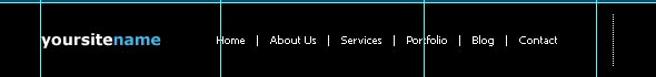
To keep things organized groups will be created for each section. So start off by creating a new group named Header and then create a new layer of 91px with a black background.
Select the Horizontal Type Tool (T) and create a simple logo, for this tutorial I used Verdana with a bold style and a size of 24pt. Align the text to the vertical guide at 100px. Now select the text layer and the background layer and choose Layer > Align > Vertical Centers.

Select the Horizontal Type Tool (T) and create six separate layers using Arial Narrow Bold with a size of 14pt or something similar. In this tutorial, the nav links are "Home", "About Us", "Services", "Portfolio", "Blog", and "Contact". Make sure the text is all in caps either by typing it that way or selecting the "All Caps" option from the character panel. Set the color to white and also set the anti-aliasing method to strong.
Align the first nav link with the vertical guide at 600px and the sixth nav link with the one at 1083px. Place the other links in between them. Select the six layers and the background layer and choose Layer > Align > Vertical Centers. To align the links horizontally with equal spacing, manually moving the layers is the best method, so make sure every layer is 35px apart from each other. So just use the shift arrow key 3 times and then the arrow key 5 times to get the link where it needs to be.

We will change the look of the nav links on active and hover state with a rounded box and a black text color. First create a new layer. Select the Rounded Rectangle Tool (U), change it to Fixed Size of 68px by 31px with a radius of 5px and a background color a light blue (#42b3e7). The width of each rounded box should have a width 34px longer than the text and a height 20px longer than the text. Repeat this step till you have hover states for all the links.

Creating the Main Content
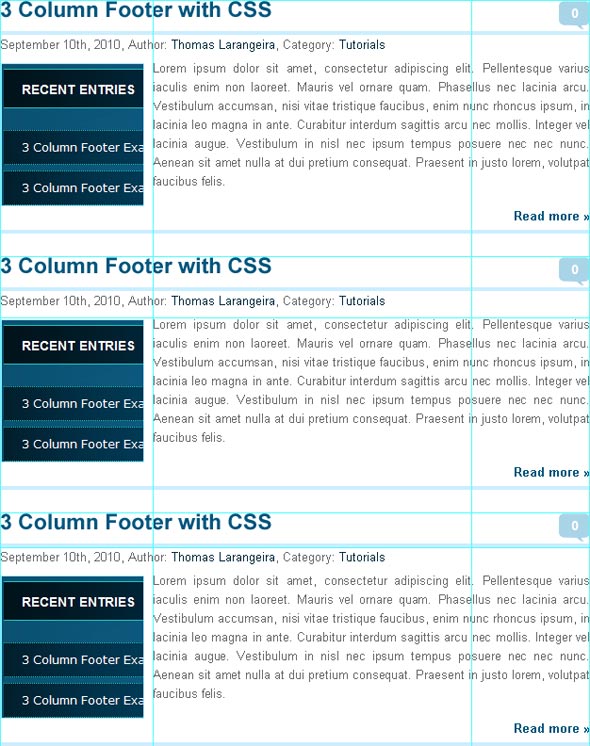
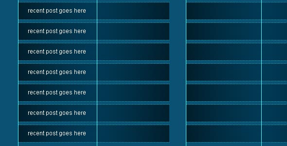
We’re finished with the header section and will now move on to the blog posts as that is the page we are making. Create a new group called "Content" and then another group named "Left".
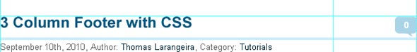
Grab the Horizontal Type Tool (T), type your title in Arial with a bold style, a size of 23pt, and set the color to a dark blue (#01567E). Align the layer to the horizontal guide at 116px. Next 15px below the title, create a 625px by 4px horizontal line with a color of (#CAEEFF).

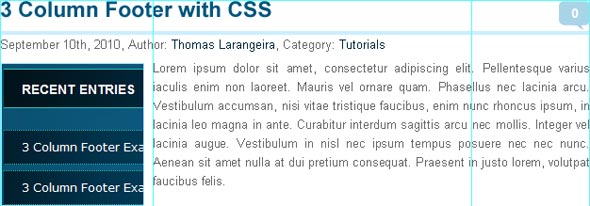
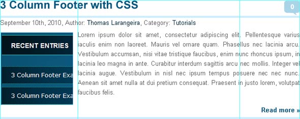
Now 5px below the line, we add the date, author, and category. I choose 13pt Arial with a regular color of (#66686a) and a link color of (#01293c). All that is left for the post heading is the comment box to the right of the post title. I simply used 34px by 31px light blue (#A9D4E7) comment bubble. For the comment total I used 14pt Arial Bold with a white color. We now have a completed post heading and can move to the blog post image and content of the blog post.
The post image will sit 15px below the heading. It is a 150px by 150px image with a 1px border with a color of (#ABE4FF). The post text is 13pt Arial with a gray color (#66686A) and I choose to make the text justified. So create a horizontal guide at 262px and 725px and then using the Horizontal Type Tool (T) click and drag to create a text box between the two guides. After go to paragraph options for the text box and click justify last left and then uncheck hyphenate.
The read more link sits 5px below the post image or content whichever is longer. The font is 13pt Arial Bold with a color of (#01567E). The horizontal divider between posts is the same as the one used below the post title. Place the divider 10px below the read more link and we have our finished content section.
Select all the blog post layers and group them together (Ctrl + G), named the group "Post 1". Now duplicate this group and name it "Post 2" Create a horizontal guide at 388px and then align the new group to it. Duplicate another group and name it "Post 3". Create another horizontal guide this time at 660px and then align the group to it.
Creating the Sidebar Menu
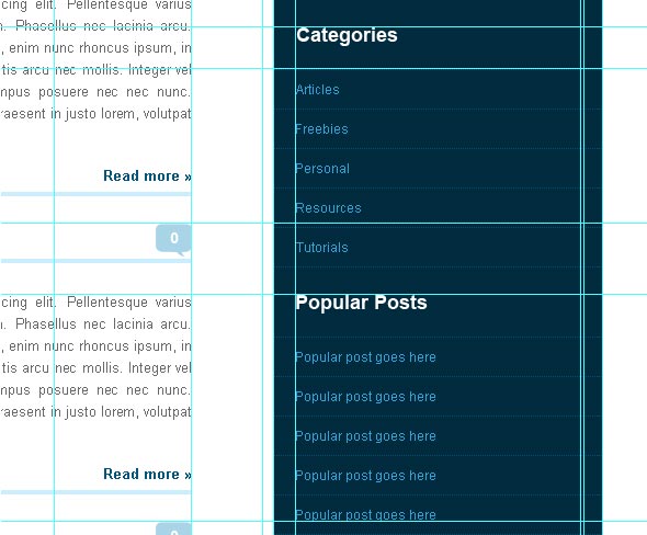
Create a 300px by 915px rectangle with a rounded bottom using the Rounded Rectangle Tool (U) with a color of (#012B3E) and a radius of 10px. This will be our sidebar’s background, align the sidebar to the horizontal guide at 91px and the vertical guide at 800px. Set vertical guides at 820px and 1080px to add padding for the sidebar.
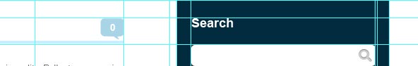
I add a sidebar heading "Search" using 18pt Arial Bold with a white color at the horizontal guide at 116px and the vertical guide at 800px. Use the Rounded Rectangle Tool (U) to create a 260px by 30px rounded rectangle between the two guides created earlier, also make sure to check Snap to Pixels. Create a horizontal guide at 154px and place the search box there. Find or create a magnifying glass icon to use as a search button and position the icon within the search box towards the right.
I add another heading "Categories" at the horizontal guide at 209px. Now add a horizontal guide at 247px and insert a dotted line (#015278) there to serve as the separation between the categories. Create five separate layers with 12pt Arial (#33A4D8) for the categories. The categories used are "Articles", "Freebies", "Personal", "Resources", and "Tutorials". Give each category 13px padding on the top and bottom and then add another divider. Group all the layers and name it "Categories". Repeat the steps for the popular posts section, listing five posts.
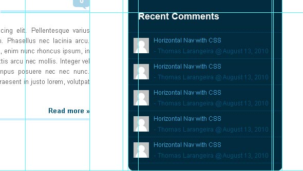
The heading "Recent Comments" is setup the same way as the others. The recent comments consists of an avatar, post title, the poster, and the date. Create a 30px by 30px avatar image and give it 10px padding all around, also make sure to add dividers as well. Both lines of text will be 12pt Arial with the post title being a light blue (#33A4D8) and the rest being a dark blue (#015278).
Creating the Main Footer
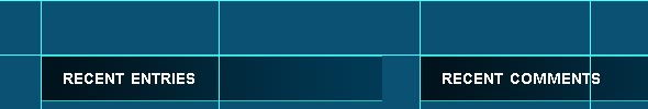
Grab the Rectangular Marquee Tool (M) and make a selection from the horizontal guide at 1113px to the guide at 1533px, then fill it with (#0A5173).
For this section, I used the 3 column setup from my earlier 3 column footer tutorial. The headings for the columns are 310px by 40px with a linear gradient overlay of (#01131B) to (#013A56) with an angle of 0° and it has 1px (#25C3BA) top and bottom borders. Now create a vertical guide at 445px and 790px and create the other two headings. The column headings are 20pt Arial Bold with the Small Caps style and a color of white. Give the heading 20px left padding and then select the text layer and the background layer and choose Layer > Align > Vertical Centers.
Now create 7 310px by 35px rectangle boxes with dotted 1px (#25C3BA) top and bottom borders 20px below the heading. Each box should have 5px padding between them. The gradient overlay still uses the same colors but is using the radial overlay in reverse option as well as being scaled to 150%. The list items are 12pt Arial with a color of white. The list items are aligned exactly as the column headings.
Creating the Secondary Footer
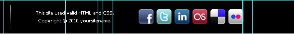
Create a group named "Footer" and then a new layer of 67px with a black background and align it with the horizontal guide at 1533px. Create a copy of the header logo and change the font size to 14pt. Grab the Horizontal Type Tool (T) and using 10pt Tahoma (#FFFFFF) add the six nav links. Add a vertical line between each link with 3 spaces on both sides of it Place it 50px to the right of the logo. Now create a vertical dotted line with 10px padding on top and bottom and place it 50px to the right of the nav links.
Next is the copyright and validation notice which uses the same text as the nav links but is centered. Type "This site used valid HTML and CSS." then enter down and type "Copyright © 2010 yoursitename." Lastly add some social icons of your choosing I used 32px by 32px icons called Social.me made by jwloh. To finish up select all the layers in the group and choose Layer > Align > Vertical Centers.
Finished!
Finally we have completed the tutorial and below is the finished product.
- Part 1: Simple and Professional Blog Layout using Photoshop
- Part 2: Simple and Professional Blog Layout PSD/HTML Conversion.
Download Source Files
- simple_professional_layout_psd (Zip, 0.41 MB)
One Comment
You’ve got to be kidding me-it’s so tarspnraently clear now!